West Village Duplex Apartment

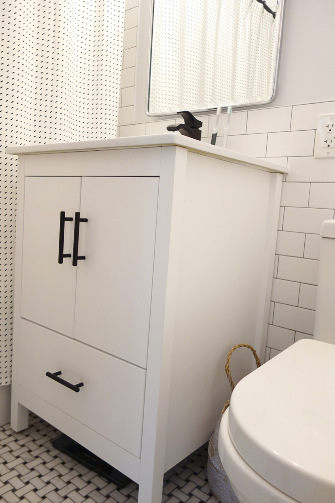
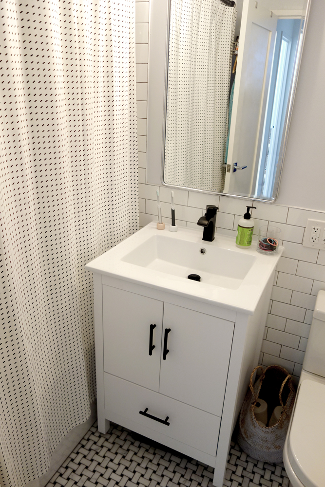
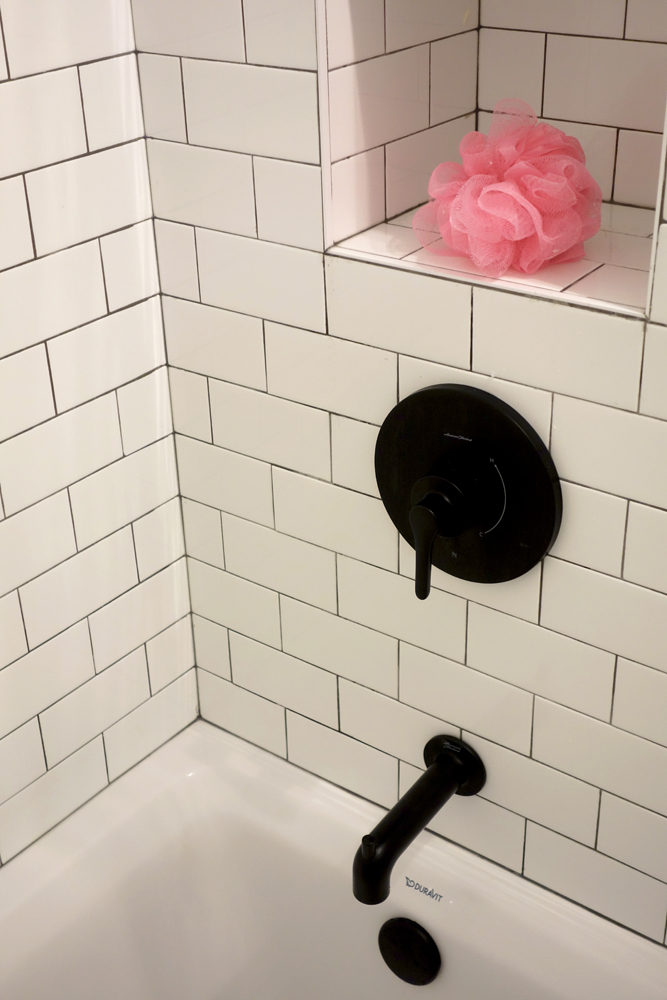
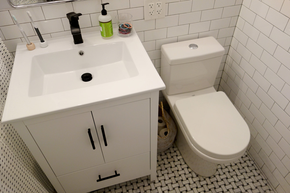
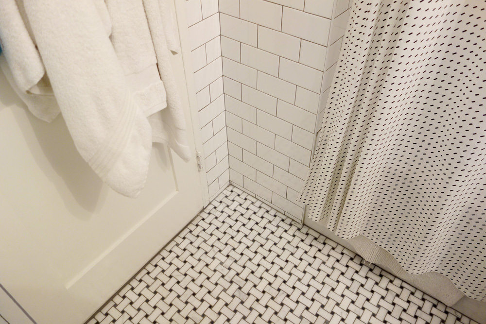
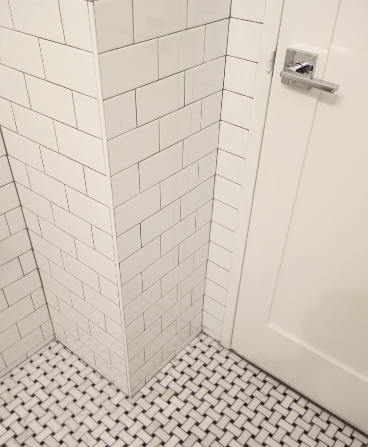
This beautiful,1,600 SF duplex three-bedroom, two-bath apartment in the heart of the West Village was originally a diamond in the rough with great potential. The coop is located on a quiet, tree-lined street and, as a top floor unit, boasts lovely southern and eastern exposures with views of this charming neighborhood overlooking the Hudson. Our clients were making a big move from the West Coast and wanted the new home to be ready in time for the start of the new school year, so Studioteka’s architecture and interior design team rolled up our sleeves and got to work! Construction documents were prepared for the coop board and NYC Department of Buildings approval and our team coordinated the renovation. The entire unit had new hardwood flooring, moldings, and doors installed, the stairs were gently refinished, and we took down a wall separating the living room from a small den on the lower level, making the living space much more open, light-filled, and inviting. The hot water heater was tucked away in an unused space under the stair landing, allowing for the creation of a new kitchen pantry with additional storage. We gut-renovated the upstairs bathroom, creating a built-in shower niche as well as a brand new Duravit tub, Mirabelle high-efficiency toilet, American Standard matte black fixtures, and a white Strasser Woodenworks vanity with black hardware. Classic white subway tile lines the walls and shower enclosure, while black and white basketweave tile is used on the floor. The matte black towel hooks, toilet roll holder, and towel rod contrast with the white wall tile, and a shower curtain with a delicate black and white pattern completes the room. Finally, new mid-century modern furnishings were combined with existing pieces to create an apartment that is both a joy to come home to and a warm, inviting urban oasis for this family of four.
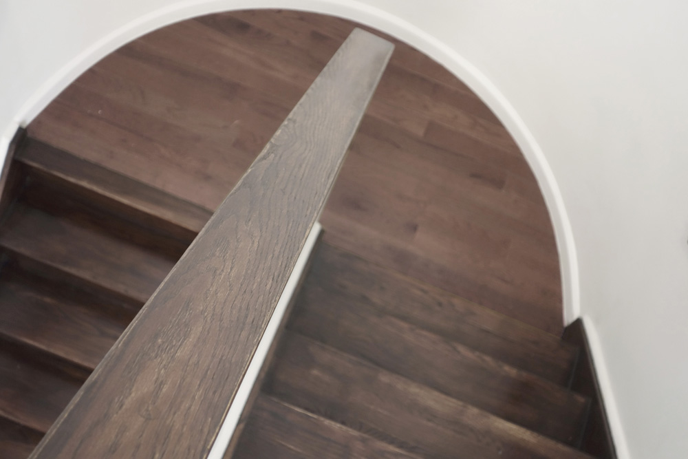
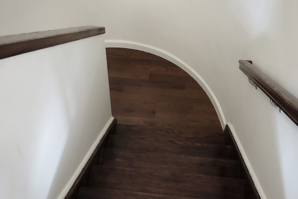
We loved the look of this stair with its moon-shaped landing and integrated new flooring at the landing with gently refinishing the original wooden stair treads for a warm and rustic feel.
Here’s the view going from the second floor with its three bedrooms and full bath, down to the living level on the floor below.
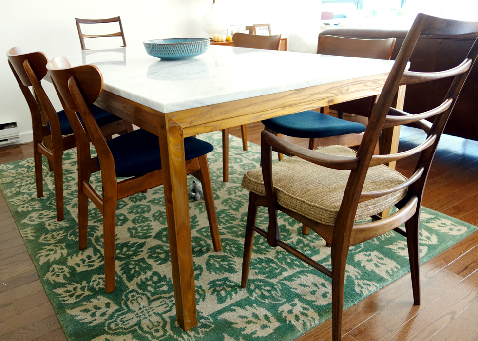
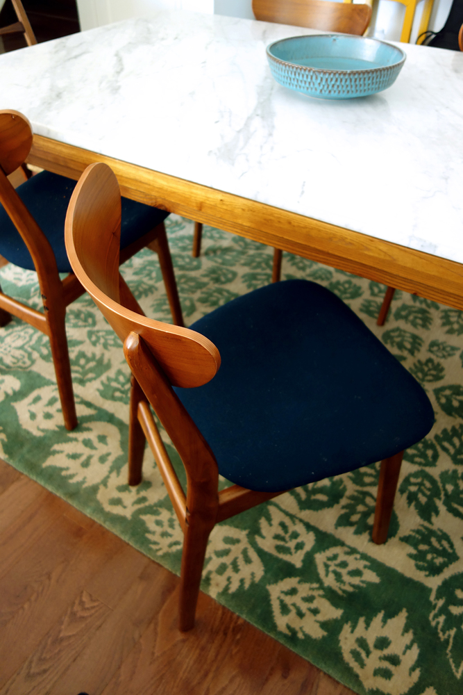
The marble-topped dining table and mid-century modern dining chairs are timeless classics, at once stylish and approachable.
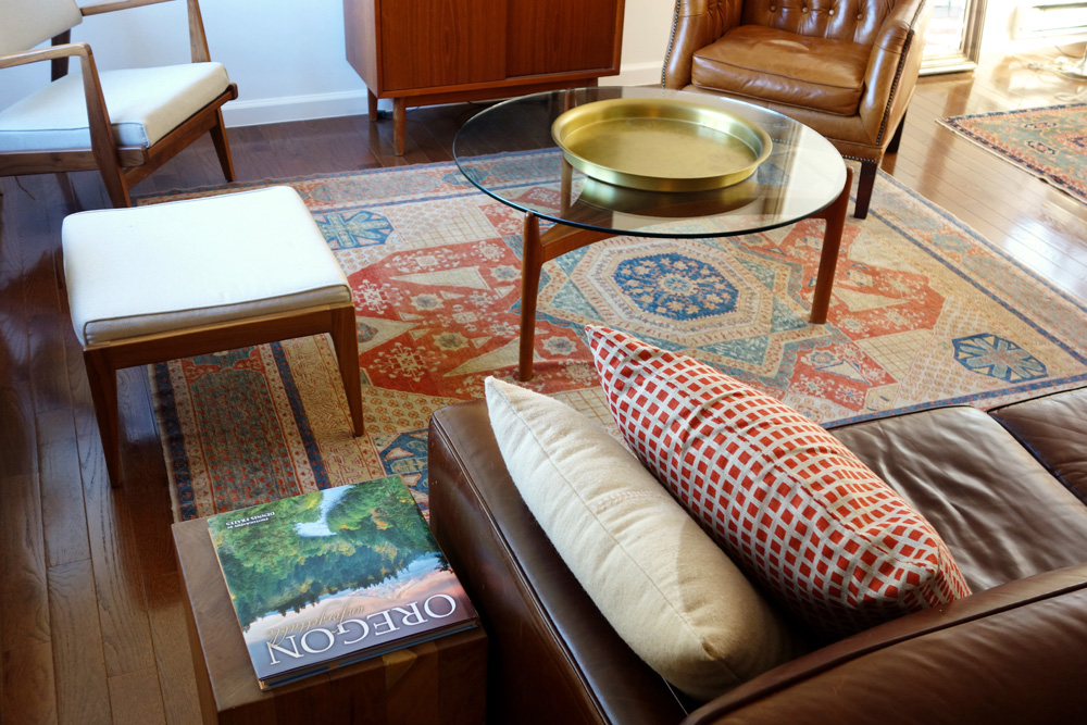
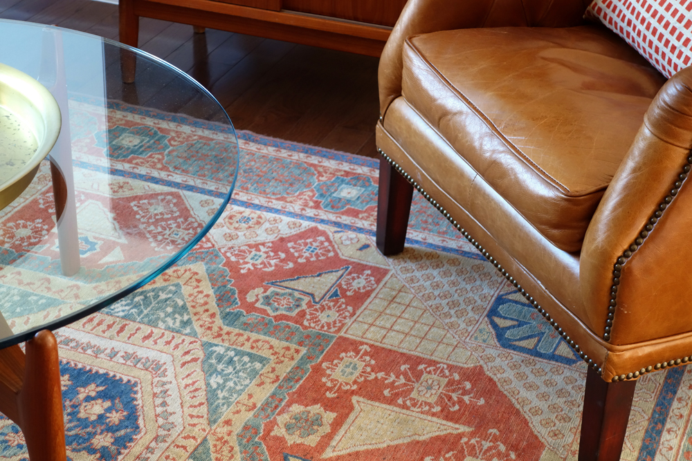
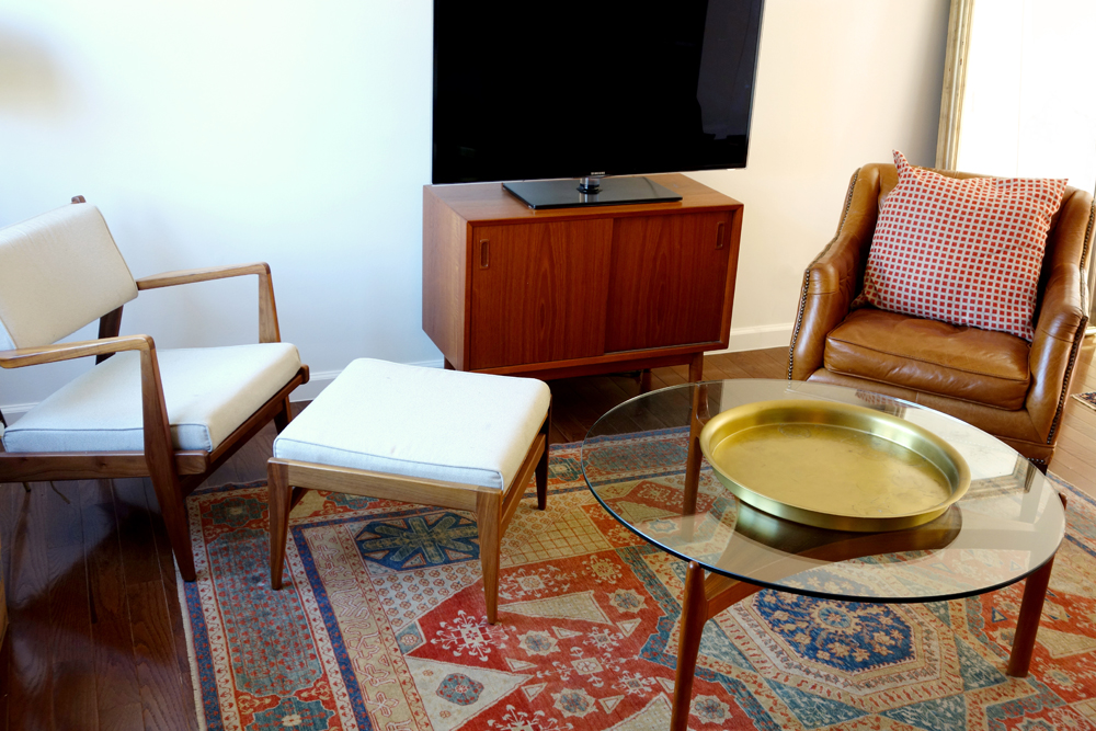
Warm hardwood flooring blends with brown leather seating, a caramel brown and cream-colored chair and ottoman set, and a lovely glass table and brass serving tray atop a rich antique red and blue oriental rug to create the perfect refuge from busy city life.
The living room’s warm color palette blends perfectly with the new hardwood flooring.
We love this living room. Our clients have just moved in, but the space is really starting to come together!
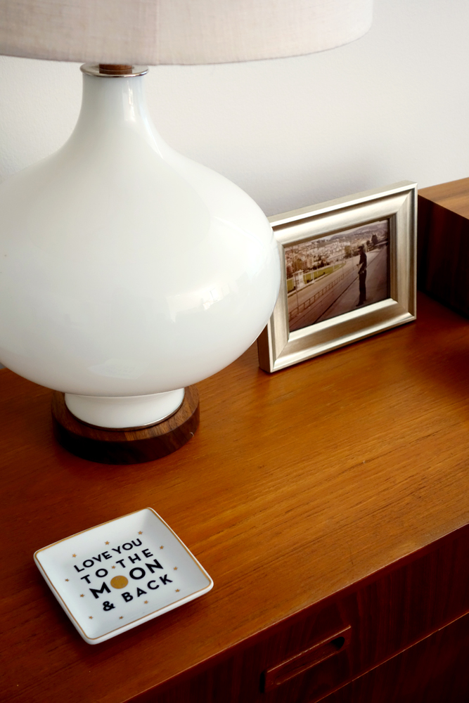
This wooden credenza, filled with family keepsakes, sits in the dining room next to the marble table.
The dining room’s color scheme combines and harmonizes both warm and cool accents.
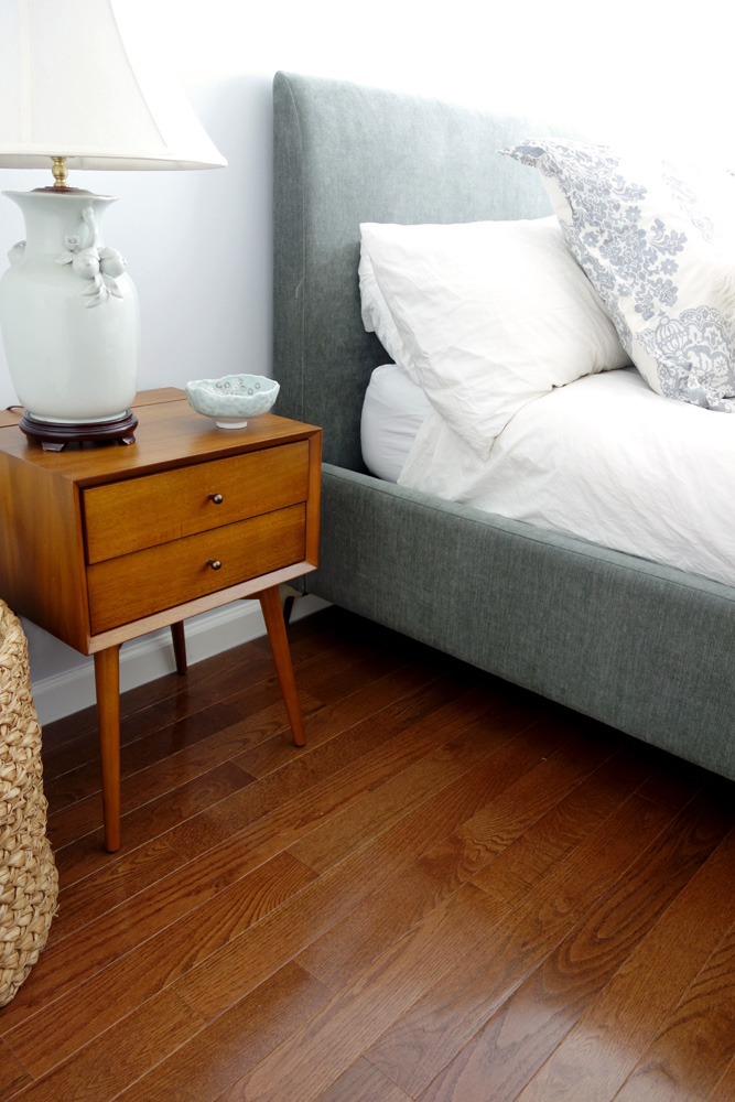
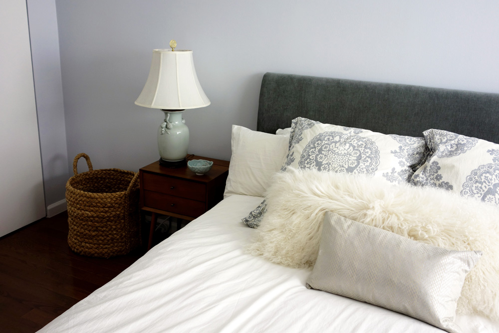
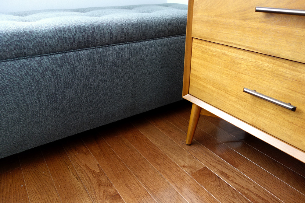
The master bedroom combines cool, restful blue and white with new hardwood flooring and a mid-century modern bedside table. An antique lamp and handmade pottery bowl complete the look.
Beautiful restful blues, grays and natural accents define this space.
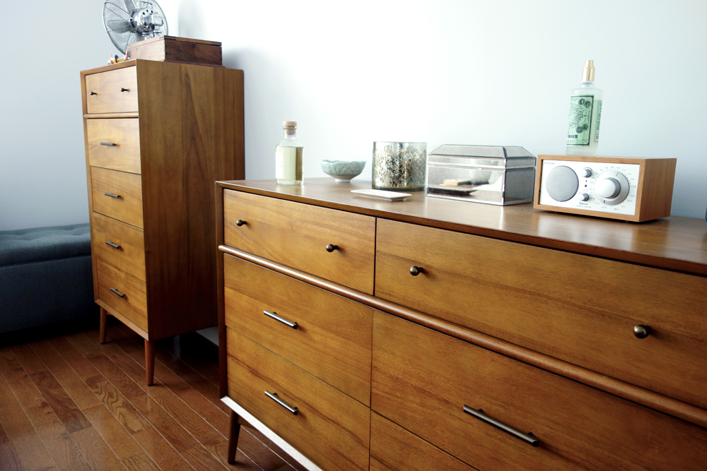
A tall dresser sits next to a blue upholstered bedroom bench while morning light streams in from the window.
We love the way the pieces in this room fit so perfectly together. This family was a joy to work with!
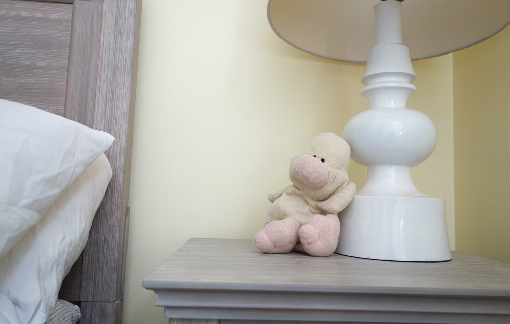
One of the children’s rooms has a yellow theme with a bed frame and bedside table with a sunbleached gray wood stain.
The dog pillow is an especially nice touch!
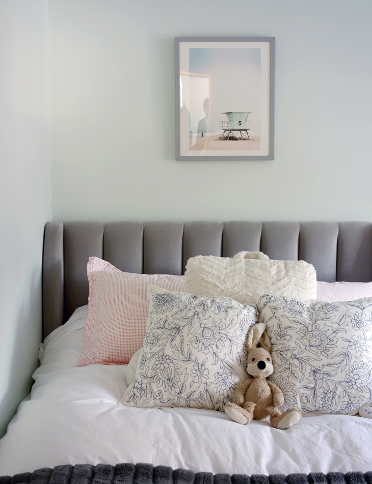
The other child’s room has a blue, gray and antique pink theme with happy bunny accents!
The new black and white bathroom has its theme carried through from the floor tile, to the matte black fixtures, the patterned shower curtain and the black metal handles on the new vanity.
The new recessed, mirrored medicine cabinet and vanity both contain space for the storage of toiletries and other necessities.
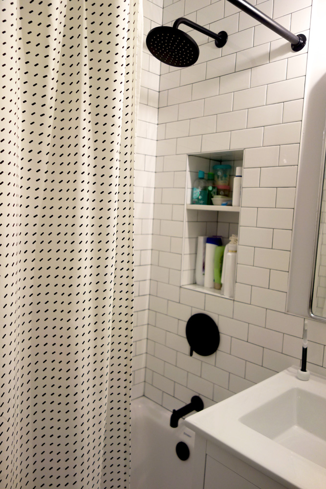
All of the accessories, down to the rain shower head and shower curtain and rod, match the overall black and white concept.
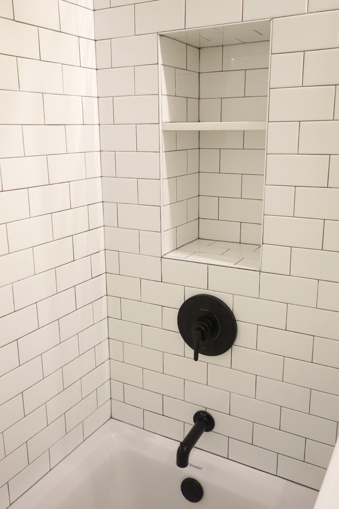
The shower niche was a lucky addition to the design as we found enough space to tuck it neatly into the wall.
This niche is our new fave!
A simple, white high-efficient toilet completes the space while also conserving water.
This image perfectly captures the room’s black and white concept with its varying patterns and lines unified by tone.
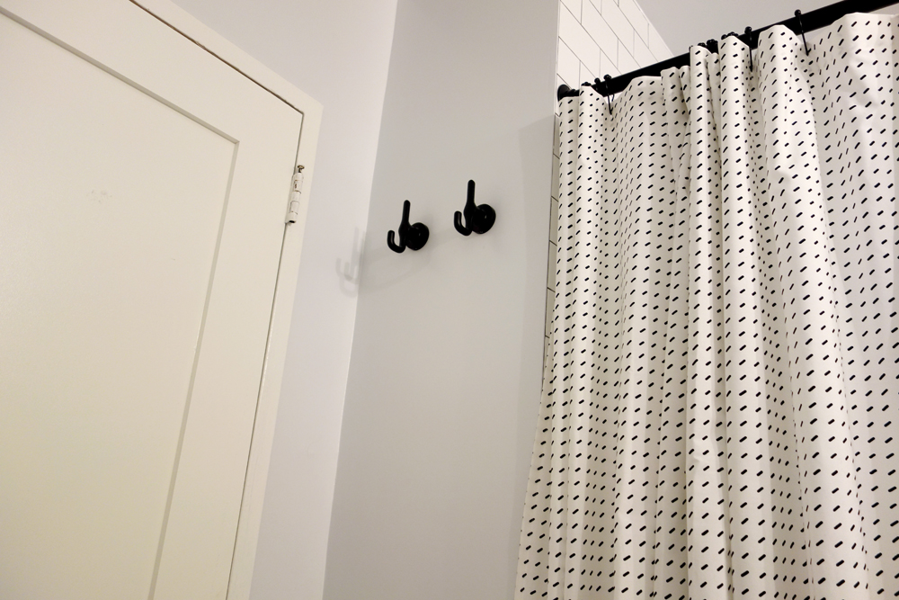
Two blackened metal towel hooks are conveniently placed on the wall next to the door.
A brand new door and door hardware complete the room.
Share
Related Posts