This section in progress, check back often for updates. There’s nothing like a great transformation! We truly love what we do and bringing our clients’ ideas to life and creating beautiful spaces for them is why we get up in the morning. We design custom elements for interiors, select furnishings, fixtures and finishes and well as creating just the right mood with lighting. We also do construction drawings and stamp projects to get building department approval in New York, New Jersey, and elsewhere and also have a great expeditor and contractors that we work closely with who can help us out. We worry about the details and streamline everything, and we can work within any budget. Our work has been published in magazines and always looks more expensive than it is. We also have a wide range of styles within which we can work, and really like the project to be about using our skill in bringing out the best in our clients’ vision. Now on to the before and after photo gallery!

We like to call this sequence a ‘render and after!’ The image on the left is one of our renderings of one of the spa-like treatment rooms in our office annex project for client Dr. Yael Halaas’ plastic surgery practice. The two images to the right are photos of the finished space! This shows that at Studioteka our design vision truly matches the built reality we deliver at the end of a project.

Another ‘render and after!’ The image on the left is a rendering of the Halaas Annex hallway with the entrances to the various offices and treatment rooms. The two images on the right show the finished space, including the hallway and the interior of a treatment room. We use powerful tools such as these to develop and demonstrate our design concepts well in advance of construction. What you see is what you get!
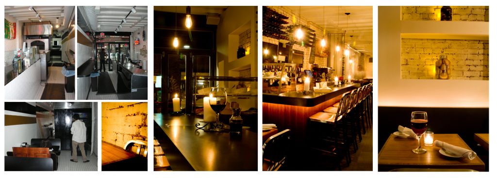
The photos on the left show the old Pizzeria De Santo that we converted into Tre, a warm and inviting Italian restaurant with an extensive wine list and Italian-style small plates from Napoli! The space had been very underutilized with minimal seating and a small office taking up much of the back. A massive pizza oven dominated the front of the space leaving little room for anything else, and the lighting was very cold and uninviting. The images on the right show our transformation where we added whitewashed brick, a new bar with a custom blackened steel bar top and bamboo plywood base, and custom niches for candles and jars of preserves that also cleverly hid pipes!
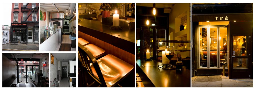
The four photos on the left show the former pizzeria before Studioteka’s design intervention, which can be seen in the three larger images on the right. The old neon storefront facade, seen in the top left image, was completely replaced by a new custom floor-to-ceiling glass folding door which can open during the warmer months. A new awning and signage in the restaurant’s signature colors, dark brown and cream, was added, along with a temporary vestibule that prevents cold air from entering the space during the colder months (far right photo). The former pizza oven (second from left, top) and office (second from left, bottom) which dominated the space and made it feel much smaller, were completely removed, allowing for a much more open dining space. Warm ‘Edison’ lightbulbs and candle niches create a warm and inviting glow when seen both from the street and from within the space itself.

On the left are two progress shots showing the place under construction. You can see the blackened steel bar top has been installed, as has the bar sink and one refrigerator. Electrical for concealed lighting hidden under the bar top was not yet installed in the two photos on the left, but you can clearly see the finished effect in the photos on the right!
The image on the far left shows the custom blackened steel wine racks we designed which had not yet been installed in one of the niches we built around pipes in the space. The finished result can be seen in the third image from the left with the bar height communal table in front. The second image from the left shows the whitewashed brick after being sandblasted and sponge painted, and the last image on the right shows the custom wine racks full and ready to go!

Studioteka recently reworked an existing medical office suite in Manhattan’s Midtown East for Dr. Yael Halaas, a successful, high-powered plastic surgeon. The existing suite lacked a consult room where the surgeon’s upscale clientele could meet with the doctor or staff to discuss procedures and options. The doctors sharing the 1,865 SF office suite had been holding patient consultations in the existing procedure rooms, rather than in a designated space. They felt that this limited their ability to really connect with clients in a safe space, and wanted the new consult room to feel warm, inviting, and luxurious.


Studioteka also designed custom cabinetry for an administrative office in the space in order to maximize storage in the busy practice. A new floor-to-ceiling unit was built along the eastern wall of the space which incorporates two lockable file drawers for confidential documents, a fold-down laptop desk, and a series of storage areas with sliding doors in white Wilsonart laminated mica. The workstations on the opposite side of the room had a new wall unit installed above the desks with three sliding, lockable doors for the doctors’ medical supplies. This allows for a much more efficient use of the space and keeps everything tidy and organized.
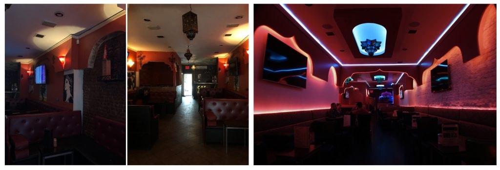
The two photos above on the left show Aladdin Lounge before the redesign, and the one on the right is taken looking into the space after a dramatic transformation! The previous lounge at this location was in need of a serious facelift–the flooring was cracked and damaged, the banquettes needed to be redesigned and reupholstered and the lighting did little to create the type of environment that the new owner wanted for the place. Studioteka stripped and gutted the existing space and completely reworked the lighting design. The new look for Aladdin is based upon the feel of a Moroccan courtyard at sunset under a deepening blue sky. Studioteka whitewashed the existing brick wall in the space, adding brightness and texture and a white palette for the color-changing LEDs in the coves and concealed in the backs of the banquettes.
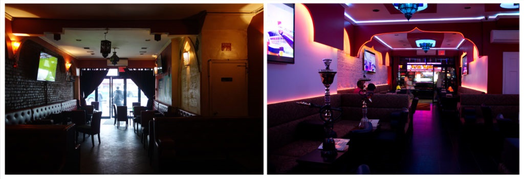
The image on the left shows the main space looking towards the street, with the dark brick wall and dated interior decor. The image on the right shows the same view after the redesign. The lighting has a variety of color settings allowing Aladdin’s new owner to create different moods within the space-based upon time of day, year, or special seasonal events. We removed the tired wall sconces, took out murals and idiosyncratic ad hoc decor and pulled the space together into an appealing new entrant to the bustling Steinway nightlife scene.
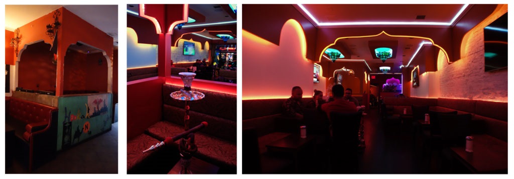
The image on the left above shows the VIP lounge before the transformation, while the image immediately next to it shows our redesign. The walls were completely rebuilt and lighting incorporated into the decorative Moroccan arches surrounding the space. The image on the far right shows some of the establishment’s patrons enjoying some of the desserts, shakes and imported hookah tobacco that makes this place so popular.

The image above on the left shows a typical seating arrangement in the lounge before the redesign. The middle photo shows a close-up of the new banquettes with an imported tea set and glasses on a silver tray. The far-right image shows the new banquettes with integrated lighting, new tables and chairs to create an atmosphere that is comfortable and welcoming.

The two photos on the left show Nurse Bettie, a Lower East Side favorite, under construction! We built the bar around a large and imposing column, which very quickly became a feature. The bar top was made of multiple cubes of end-grain wood, while the finish surrounding the bar was made of donated blackened steel from a neighboring project. The concrete floor with steel beams was left exposed and repurposed 50’s barstools were added and reupholstered. A window above the bathroom door was salvaged from Ratner’s, a nearby staple which had recently closed, as was the bathroom door. The project was about introducing elements with weathering, patina and contrasting textures, which we were then able to combine with new ones to create a unique and timeless mix.

Studioteka was asked by a happy former medical client to gut renovate a dilapidated office across from the doctors’ main office suite into a new annex for the practice in Manhattan’s Midtown East. The image far left shows what would become the larger of the two treatment rooms and the only windowed space in the annex. The two images on the right show the space after our redesign. We provided full architecture and interior services to create two new treatment rooms, a designated photo room, a small administrative office and additional storage. The practice’s successful plastic surgeons wanted additional rooms where patients would be able to receive treatments in a warm, inviting and luxurious spa-like environment. A visual connection between each of the treatment rooms and the administrative office was created by the addition of clerestory glass which allows natural light to pass between the spaces in the suite.

The two images on the left show the annex before construction and our complete gutting of the space. The two on the right show two of the treatment rooms after we finished! An elegant white patient chair and round doctor’s stool sit in the middle of each treatment space. Contrasting wallpapers, one with a natural texture, the other with an embossed white pattern, wrap the room, while a sleek, silver chair rail finishes the look. Sleek white cabinets were chosen to contrast with dappled gray countertops and resilient flooring the color of warm, brown leather, while a pair of minimalist modern suspended lights brighten and warm the space.

The two photos on the left show the annex before our intervention. The hallway was cramped and dark, and the carpet had seen better days. The hallway post-facelift has a soothing, neutral palette with warm stone flooring and a wall unit to one side, and a row of glass sliding and barn doors to the other, allowing light from the rooms beyond to filter into the circulation space of the annex and open up the space.

Located in Queens, this 1,119 sf project converted a former Jiu-Jitsu studio in a commercial storefront into the new offices of City Homes Realty Group, a bilingual family-run real estate practice.The project combines two distinct areas, one more public, with a receptionist desk, a waiting area for guests and a glass-enclosed conference room for meetings and closings, and another more private rear space with custom workstations that wrap the perimeter of the space and a glass-enclosed office volume for the group’s husband and wife team who sit facing one another at a custom, T-shaped station with bespoke file and storage drawers below the desks.

The back wall of the private office has white display shelves for the group’s awards, artwork, and keepsakes, as well as custom, integrated file drawers for the wife’s multi-services clients.


The entry to the suite is framed on one side by the conference room which creates a diagonal that leads guests directly to the receptionist’s desk, and a waiting area along the other wall flanking the space. The receptionists’ backdrop is a wall in white stonewashed by light from above that highlights the firm’s silver logo which is mounted on the accent wall. The custom workstations then wrap the back of the space, allowing for desk space for family members, as well as room for potential expansion.

Located in Manhattan’s Flatiron District, this 3,100 square foot space for an innovative, cutting edge marketing firm, is a different take on the urban workplace. The project combines fluid custom workstations specifically tailored to the firm’s dynamic working style, as well as spaces for creative encounters that allow for chance meetings and informal discussions. The entry is framed on one side by a curved DJ booth and waiting area, and on the other by a reception area. This area is the start of a custom wall which also incorporates a kitchen with a bar height table for informal meetings, workstations, and a production area.

Adjacent to the kitchen is a custom lounge pod (on the left, seen under construction) designed by Studioteka with a partial surrounding wall which provides another space for collaboration. In this way, we energize the entry sequence and provide visitors with an experience of the dynamic interaction that has made the company so successful.

The image on the left shows the DJ booth under construction, while the one on the right shows the finished result! Taking inspiration from a pinball machine, the DJ booth forms a bumper, while the partners’ offices form an island in the middle of the space, flanked by workstations for the various creative teams, which are organized by project and also by volume. A large conference room sits adjacent to this space as one of the few enclosed moments in the plan.
