There’s nothing like a great transformation! We truly love what we do and bringing our clients’ ideas to life and creating beautiful spaces for them is why we get up in the morning! We design custom elements for interiors, select furnishings, fixtures and finishes and well as creating just the right mood with lighting. We also do construction drawings and stamp projects to get building department approval in New York, New Jersey, and elsewhere and also have a great expeditor and contractors that we work closely with who can help us out. We worry about the details and streamline everything, and we can work within any budget. Our work has been published in magazines and always looks more expensive than it is. We also have a wide range of styles within which we can work, and really like the project to be about using our skill in bringing out the best in our clients’ vision. Now on to the before and after photo gallery!
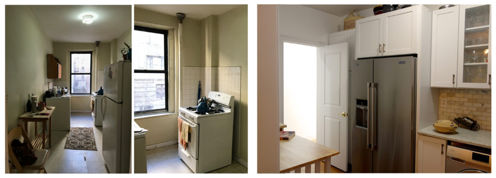
The image above shows the before and after state of the kitchen in Riverside Drive Apartment, a 2,000 sf apartment we gut renovated in Washington Heights. What a transformation! The original kitchen was fragmented and narrow, and there was no direct connection to the dining room. We opened a doorway between the two spaces which also had the added benefit of adding more light to the room. We then reconfigured the kitchen, adding a breakfast nook and all new appliances which included a washing machine, dishwasher, microwave with integrated range hood and a chef’s range for the client’s many dinner parties!
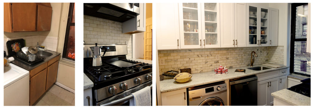
The photos above show the kitchen before, on the left, and the kitchen transformed on the right. A long stone countertop with neutral tile backsplash runs the length of the kitchen with white cabinetry with inset glass, creating the perfect space for cooking with plenty of area for both storage and prep work. The new dishwasher and washer/dryer are tucked under the counter and seamlessly integrated into the space of this beautiful new kitchen.
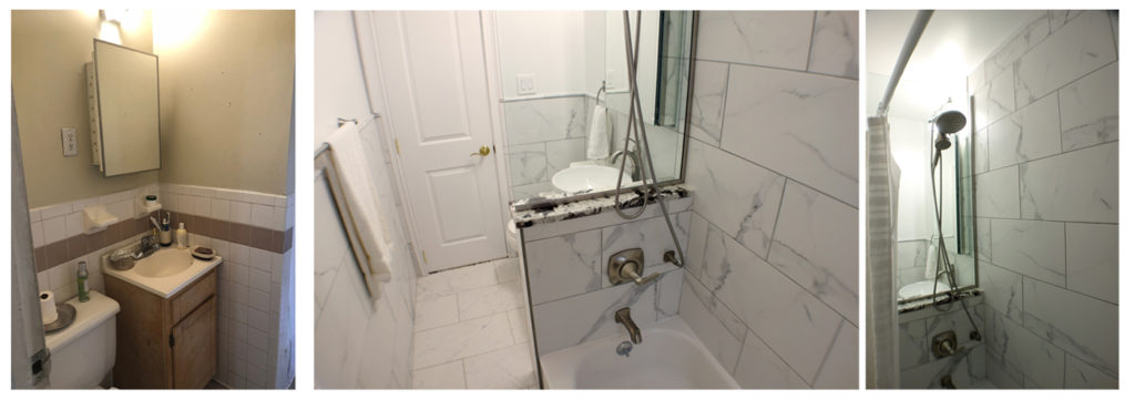
The photo above on the left shows the bathroom in our Riverside Drive Apartment project before the renovation, and the two on the right show the same space after. The original bathroom was very tight and cramped, and light didn’t enter the space because of a wall that separated the toilet, sink and vanity from the shower. Studioteka replaced the full height plumbing wall with a lower one, and put a glass divider between the shower and the new sink, allowing light to pass into the rest of the space from the window.
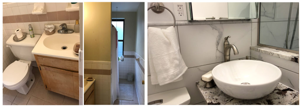
The two photos above on the left show the original bathroom, and the larger image on the right shows the new renovated space with new vessel sink, stone vanity top, and glass shower wall in more detail. All new plumbing fixtures and clean white wall and floor tile were also installed to completely upgrade and update the space. See more about this project here!
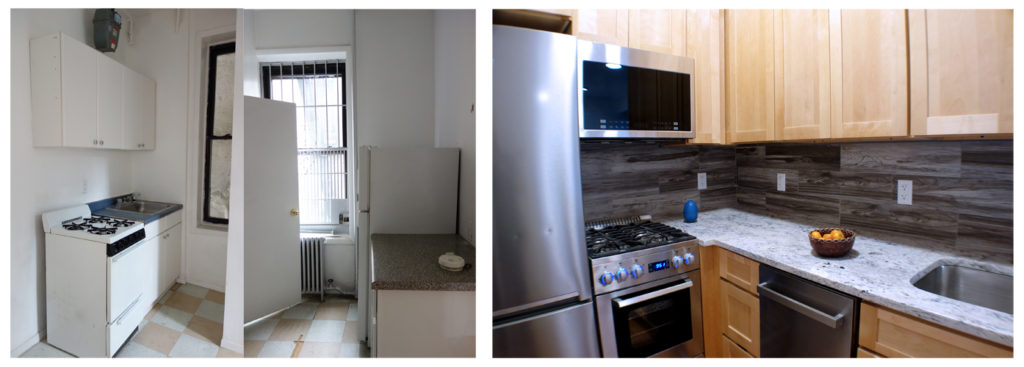
The kitchen in this unit in the East Village Microapartments project was awkwardly laid out, with a bathroom and standing shower located in a room that separated the sink and stove from the refrigerator and counter space. The addition of a diagonal wall allowed us to enclose the window to the fire escape inside a new, ADA adaptable bathroom with stacked washer/dryer, while making a kitchen layout that has everything at the tenant’s fingertips.
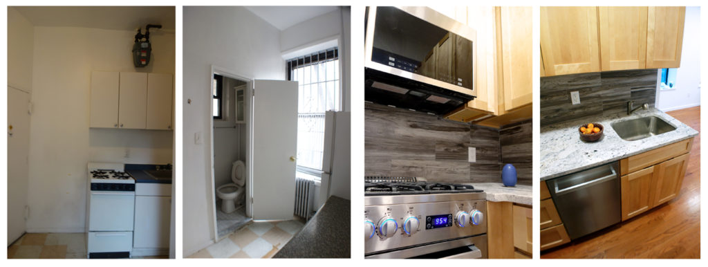
This photo clearly shows the awkwardness of the original layout. The stove was right next to the entry door, and the toilet was across from the refrigerator. Prep space and cooking space were diagonally opposite one another, making for difficulty in preparing meals, and the unit, in addition to needing an upgrade in terms of appliances, lacked a dishwasher and microwave. On the right you can see the transformation to sleek, upgraded appliances, the microwave has an integrated range hood, the cabinets are all solid wood and custom made, and the new layout is a very functional one for a kitchen where every bit of space counts!
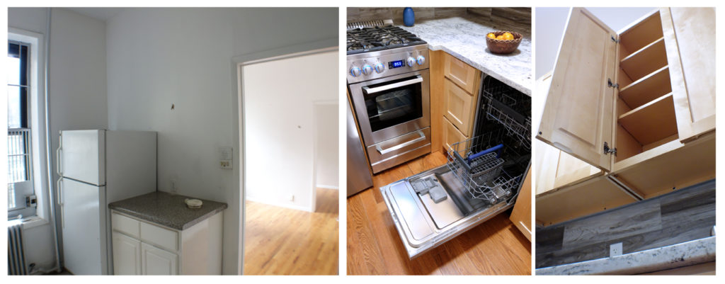
The photo on the left above shows the kitchen before, and the two on the left are after. We removed the walls which divided the space, opening it up, while still allowing for a very functional layout for cabinetry, drawers and appliances.
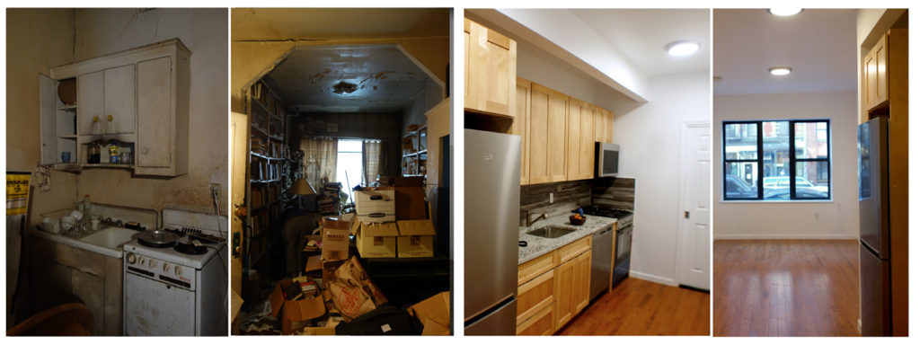
This unit in the East Village Microapartments project was in terrible disrepair, having been inhabited by a hoarder. You can clearly see that from the two before pictures on the left! The original configuration of the kitchen, located along the short wall with an L shape, and bathroom, with insufficient clearances around plumbing fixtures, was also not optimal. The layout didn’t allow for enough space for cooking prep or sufficient space for storage, not to mention the washer/dryer that the client wanted to install in the bathroom of this rental unit. The apartment needed to be completely gutted, and had new flooring installed throughout, as well as new windows with a larger operable area to provide adequate ventilation and space for a window air conditioner during the summer months. Our redesign also allowed for the creation of a deep closet with ample space for storage across from the new galley kitchen, in which we used completely updated appliances and the same solid wood custom cabinetry as in the first unit shown.
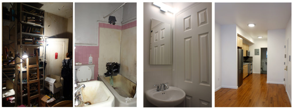
This photo shows the tight and sub optimal configuration of the original bathroom, not to mention the oversized sink which created a very restricted path to the toilet and tub. Our complete transformation can be seen in the two photos on the right. The first shows the new sink and mirror, with the closet that contains generous storage and space for a washer/dryer unit. The far right photo shows the space seen from the front of the apartment, with the large closet opposite the galley kitchen.

The series of photos above show the kitchen in the Riverdale house before and after our intervention. The original kitchen had not been updated since the 1960s, and was badly in need of an upgrade. The wall separating the kitchen from the dining room created a cramped, dark space which had a very awkward layout. We added all new cabinetry and appliances and relocated the gas range to the other side of the kitchen, allowing for a larger expanse of counter space for meal prep.

Here you can see the wall in the before picture that used to separate the kitchen and dining areas. By taking the wall down between the two spaces we were also able to add a large breakfast bar and open up the space considerably, bringing in more natural light from the back garden and making communication between the two spaces seamless and perfect for entertaining.We added a brand new kitchen window as well as a new door to the back garden with operable sidelights going all the way to the ground allowing the interior spaces to flood with natural light
